The new orxonox web page will be placed inside Trac (the wiki), so everyone can change it and add content.
Trac will be updated soon, so we get template support.
The plan:
https://dev.orxonox.net/attachment/wiki ... GP1158.JPG
https://dev.orxonox.net/attachment/wiki ... GP1159.JPG
viewtopic.php?t=159
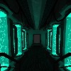
http://people.ee.ethz.ch/bknecht/orxonox_website.jpg
The first draft:
* The header was done by beni's brother.
* The html and css is a cheap rip-off from http://listen-project.org/ with some changes. I know there are bugs.
* The menu items "api" and "pps" are missing (there was no space left)
Link: http://people.ee.ethz.ch/~wenners/files ... draft1.htm
In my opinion, there are too many menu items. Maybe we should drop some or consider two menus (like on the screenshot or on http://developer.pidgin.im/ ) But that would be ugly.
Any other suggestions?
New Orxonox Web Page
Moderator: PPS-Leaders
-
Nowic

- Thanathon, God of the lower Planes
- Posts: 186
- Joined: Tue Oct 03, 2006 7:53 pm
- Location: Zürich
- Contact:
New Orxonox Web Page
"I've always lived cheaply. I live like a student, basically. And I like that because it means that money is not telling me what to do. I can do what I think is important for me to do. It freed me to do what seemed worth doing." -- Richard Stallman

Hi Nowic,
Very well done mock-up!
I understand what you mean, there is not more place for menu-items and we can't drop any of them.
In awareness of this, I think your suggestion to make a pidgin-like approach with a separated developer section is a good one.
Perhaps you manage to create more similar menus and sub-menus designs so they do not differ so much in style as they do in the pidgin example.
Maybe it's possible to make a hack, so the buttons that are related to the public page (screenshots, download, about, forum, wiki) only appear while being on the public page, and the track-related buttons (timeline, source, tickets, api, pps, home) only in the wiki. With the buttons wiki/home the user can swith between the two modes.
Advantage: The default user doesn't want to see options like "api" or "browse source", he just wants screenshots and some informations. On the other side, the developers don't need to click through the gallery, they just want the wiki-options.
Separating the two sections with a simple hack would solve the problem with the space for the buttons and make the page more clear.
Disadvantage: You'll have to code that hack. Well, it's pretty simple, but it complicates the updating to newer track-versions. But hey, you wanted to create a website, so do it, just extending the track is a bit too cheap.
Oh, and by the way: I liked the idea you proposed, black background with stars and so on, a bit like the forum. But it's too white now. We're not selling business stuff, we're creating a game.
The design is good for the wiki, but not for the public page. You won't expect a game behind that page.
-
Nowic
- Thanathon, God of the lower Planes
- Posts: 186
- Joined: Tue Oct 03, 2006 7:53 pm
- Location: Zürich
- Contact:
Simple solutions are good solutions. I really don't want to change the trac source.
I didn't take a closer look at the template system yet, but the menu seems to be defined as text and CSS code (no images). That means it could look anything we like (and I'm able to code). But there are just too many items for one row.
Maybe we could just hide the development buttons on certain pages with a java script hack. I'll think about it.
User: Home, Screenshots, Download, About, Development, Forum
Dev: (Wiki), PPS, Timeline, (Roadmap), Browse Source, View Tickets, API
Do we really need "PPS"? Wouldn't a link on "Home" or "Development" be enough?
"I've always lived cheaply. I live like a student, basically. And I like that because it means that money is not telling me what to do. I can do what I think is important for me to do. It freed me to do what seemed worth doing." -- Richard Stallman
-
Nowic
- Thanathon, God of the lower Planes
- Posts: 186
- Joined: Tue Oct 03, 2006 7:53 pm
- Location: Zürich
- Contact:
A quick javascript hack to hide certain parts of a page on demand:
http://people.ee.ethz.ch/~wenners/files ... _test.html
In the final version I'll check the url. If it is a user page, it hides all the stuff we don't want on a user page. This solution is not very flexible, but solves our problem in a simple way. Browsers with no java script support just don't hide it.
Do you like it?
If we agree on a menu structure, beni's brother could start designing the "user" menu images. (like here: http://people.ee.ethz.ch/~bknecht/orxonox_website.jpg )
The trac menu will get a background image or a color that matches the header.
@x3n: The current header is too bright for a dark background. But I could use a decent gray, so it looks less business like.
Thanks for the feedback!
"I've always lived cheaply. I live like a student, basically. And I like that because it means that money is not telling me what to do. I can do what I think is important for me to do. It freed me to do what seemed worth doing." -- Richard Stallman
Yes, the java-hack is a good idea.
Oh, and i forgot one thing in the last post:
You could leave the "Home" button out, clicking on the Orxonox-header has the same effect. That would save some space. But if we have enough space with the java-hack, that won't be necessary.
@background: I agree, a dark background doesn't fit to the header. Either you have to make a darker header (if I remember correctly, the poster for the last convention used a dark background for the same motif) or you try the decent gray. But only if it looks good, I could live with a white background too.
-
Nowic
- Thanathon, God of the lower Planes
- Posts: 186
- Joined: Tue Oct 03, 2006 7:53 pm
- Location: Zürich
- Contact:
Thanks! I'm going to start with the template on friday (short holiday trip).
"I've always lived cheaply. I live like a student, basically. And I like that because it means that money is not telling me what to do. I can do what I think is important for me to do. It freed me to do what seemed worth doing." -- Richard Stallman
I would give you the gallery stuff, if I could but I haven't found a single mail address on the whole listen page. Inow know the ip of their chief programmer, but still can't write a mail to him...
There is a lesson to be learned: We should maybe include some contact info in the main page; just some short contact info in a box above or below the news box.
There is a lesson to be learned: We should maybe include some contact info in the main page; just some short contact info in a box above or below the news box.
The sky above the port was the color of television, tuned to a dead channel.
-- William Gibson, Neuromancer
-- William Gibson, Neuromancer
Well... with contact I didn't mean dating platform but mail addressand all the stuff which is on the old page like mail lists and irc channel.
I didn't want to promote a community meeting place
I didn't want to promote a community meeting place
The sky above the port was the color of television, tuned to a dead channel.
-- William Gibson, Neuromancer
-- William Gibson, Neuromancer

Well yeah. Guess you're right. It couldn't hurt to make it easy to find one's ICQ number or mail address. We will have something like the credits. We should put contact information either there or link from there directly to the user pages where a lot of us have some contact information.
"I'm Commander Shepard and this is my favorite forum on the internet."
-
Nowic
- Thanathon, God of the lower Planes
- Posts: 186
- Joined: Tue Oct 03, 2006 7:53 pm
- Location: Zürich
- Contact:
Thx @ patrick for upgrading.
I have merged most of the draft into our page. Now I'm waiting for the images of the main menu.
http://dev.orxonox.net/
@hofzge: very sad, but I could still steal some of their CSS code
I have merged most of the draft into our page. Now I'm waiting for the images of the main menu.
http://dev.orxonox.net/
@hofzge: very sad, but I could still steal some of their CSS code
"I've always lived cheaply. I live like a student, basically. And I like that because it means that money is not telling me what to do. I can do what I think is important for me to do. It freed me to do what seemed worth doing." -- Richard Stallman
Who is online
Users browsing this forum: No registered users and 2 guests